
How to create a custom report
Custom periodic reports with your financial information.
ℹ️ Video translation into English in progress
To create a custom periodic report, the first thing you need to do is go to the Reports section.
Click on the Add report button to create a new report. A screen will open with the report settings. On the left side of the screen, you can customize the report’s features:
Report Name: The name by which you will identify the report.
Frequency: Daily, Weekly, or Monthly.
Reception Time: The time at which you will receive it.
Receive the report even when there are no transactions: By default, the report will only be sent if there are transactions during the period, but you can select this option to always receive it.
Products to Include: Select the products that will be included in the report. You can also add another bank from this section if you haven’t done so already.
Channels where the report will be sent: You can choose one or more channels to receive this report. Additionally, you can customize the email subject or the summary message for each of the channels. This feature is very useful if you want to automatically share your report with others. You can also add another channel from this section if you haven’t done so already.
En la parte derecha de la pantalla se muestra una vista previa del informe. Puedes acceder al editor drag and drop pulsando en el botón Editar plantilla. Una vez dentro del editor puedes seleccionar y arrastrar los bloques que quieras a tu informe. Aquí tienes todos los tipos de bloques que puedes incluir:
These are lists of items with two formatting options:
Compact List: To display transactions, only income, or only expenses. Additionally, you can choose to group them by Category, Date, Connection, or Bank Product.

Block List: To display the balances of the products included in the report.

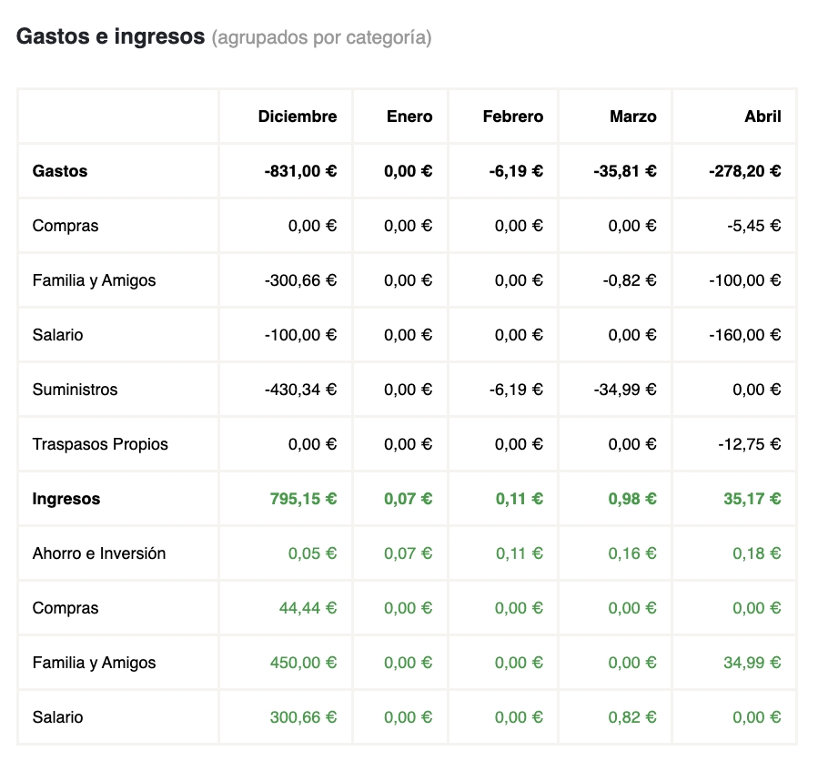
These are Excel-style tables for viewing the details of income and expenses.
You can select the number of periods (columns) to include and whether to group the income by Category or Tag.
These allow you to present the information visually. You can choose from 3 types of charts:
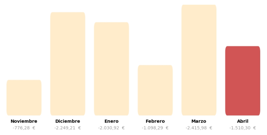
Bar Chart: To display income or expenses in columns. You can select the number of columns to show, and they will adapt to the report's period (days, weeks, or months).
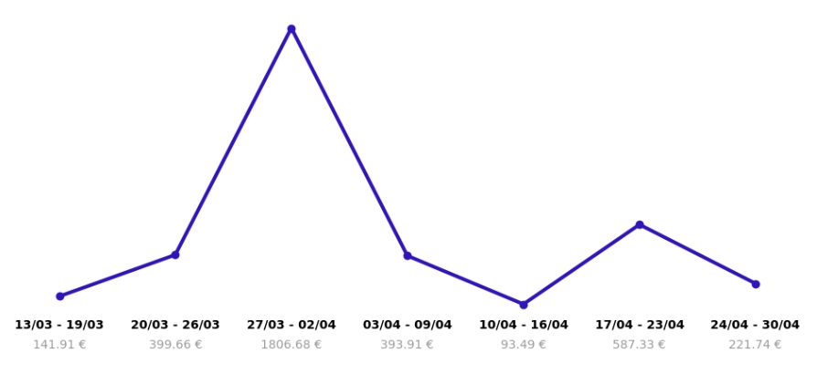
Line Chart: To show the trend of expenses or income. You can select the number of points to display, and they will adapt to the report's period (days, weeks, or months).
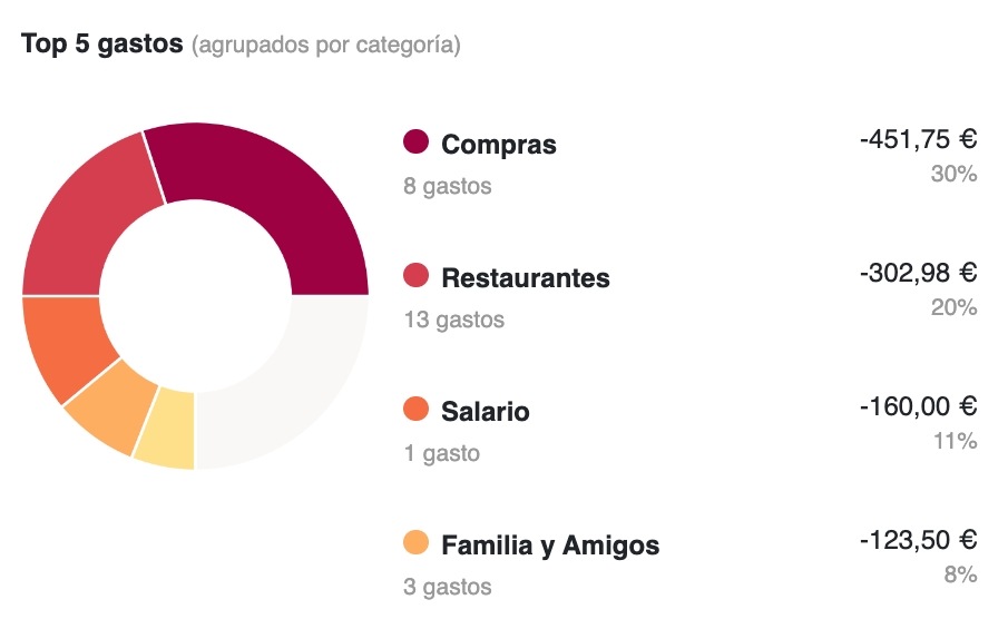
Donut Chart: To display the largest income or expenses grouped by category or without grouping.
To include a custom text block with dynamic variables.
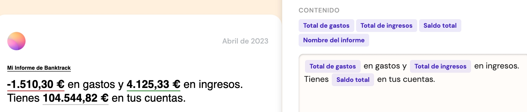
You can customize the font size and whether to highlight the dynamic variables or not.
This is very useful for separating sections of the report or providing a descriptive summary.
Once you have edited the characteristics and the report template, remember to click on Save report to create the report and start receiving it automatically.
If you have any questions when creating a report, you can contact us in the chat that you will find in the lower right corner of the screen.
Última actualización
¿Te fue útil?